Did you know that it takes less than 50 milliseconds for users to form an opinion on your site content? In under one second, most online browsers decide whether your online store is engaging enough for them to stick around.
In a competitive e-commerce landscape, site engagement is your ticket to conversion success. With so many competitors to battle against, small businesses can easily sink below the net if their site speed, content creation and UX design fall short of the mark.
The question is, how do we measure site engagement, and what can we do if we see that all-important dip in site clicks?
Stick with us as we evaluate the importance of e-commerce engagement, and reveal five essential actions to take if you identify a low-traffic zone.
What is User Engagement?
According to experts at HotJar, “User engagement is how valuable users find your product, based on how much they interact or ‘engage’ with your website or service.”
You’ll be able to identify levels of user engagement based on a browser’s actions. For example, if they opt to download and share your content or simply spend a period of time interacting with your site’s tools and features, they are likely to become potential leads for conversion.
Levels of engagement can be broken down into three stages:
- Impression Engagement: This is the initial browsing of a site’s landing page, often in regard to attractive content or a specific product or service.
- Interactive Engagement: A potential lead now begins to navigate an online store and physically interact with its content.
- Conversion Engagement: Finally, this consists of a lead adding a product to the checkout and converting as a site customer.
If you can keep your user engagement high, you’ll reap a number of business benefits in return. From a more loyal customer base to a higher Google SERP score, if your traffic is constantly engaged with your content, your online store will appear as an authoritative player within your niche and inevitably attract more leads to your domain.
The Importance of Engaging Your Users in 2023
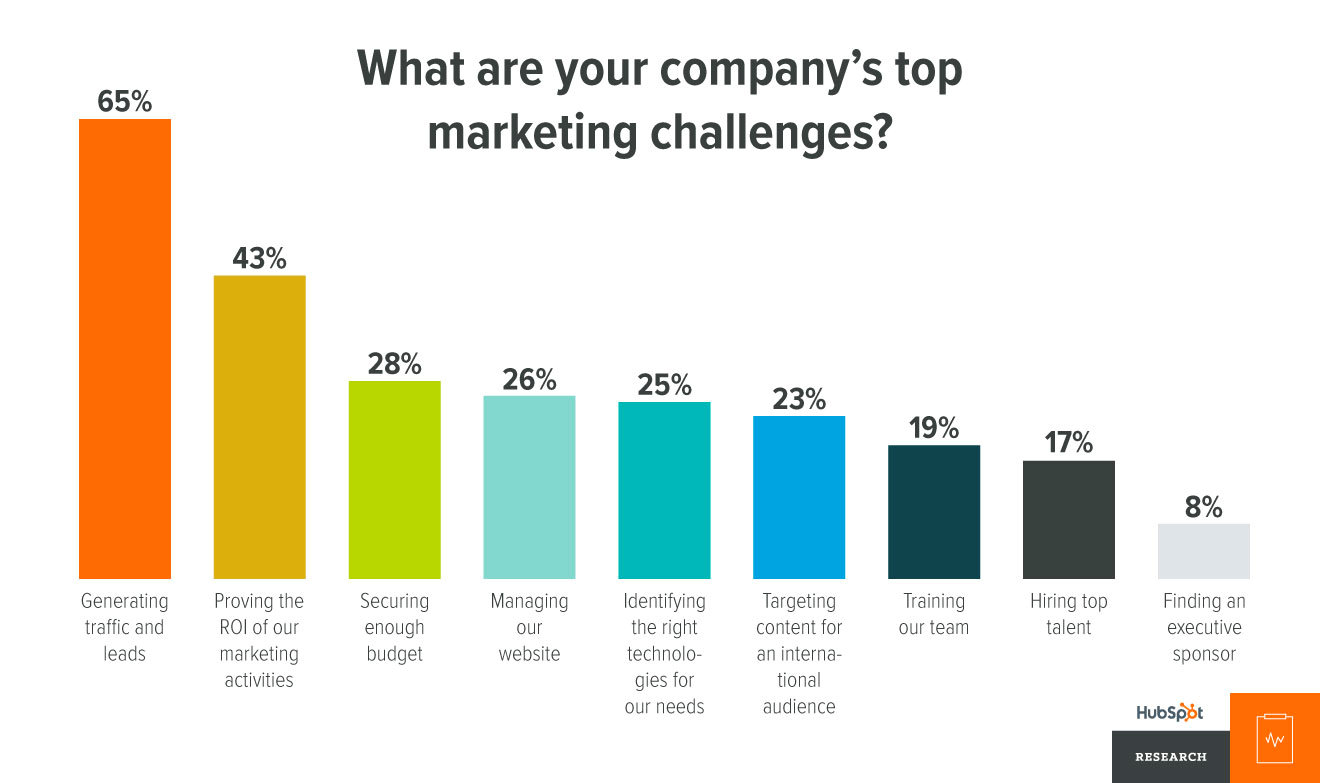
User engagement is the key to marketing success in 2023. With over 65% of marketing experts now ranking lead generation as their top challenge in a modern-day online marketplace, encouraging the traffic you do have to stick around is crucial.

If your website masters its content engagement levels, your online store will quickly open up to a larger audience.
Engaging content doesn’t just sell your products and services, it actively forces consumers to start thinking about your brand as a whole. If your content is engaging, it is more likely to be shared, discussed and reviewed, which in turn boosts brand awareness and starts filtering down to new potential leads on multiple platforms.
90% of consumers are more likely to interact with a brand that has been recommended to them. Therefore, if you engage your audience on first impressions, you’ll quickly give them something to talk about.
So, this begs the question. How do you ensure that your site engagement levels remain high, and what can you do to encourage your users to stick around? Let’s have a closer look.
What To Do If Your Site Engagement Dips?
No online brand is perfect. Every e-commerce company will see highs and lows when operating as an online business. For example, a swimwear brand can expect to see some engagement dips in the winter months as fewer consumers plan on jetting away on holiday.
However, if you’re seeing constant dips or a steady engagement decline on your online store, it could be time to take action.

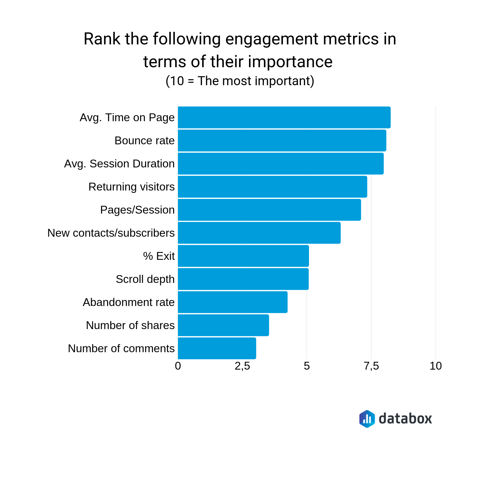
As you can see here, the top engagement metrics to monitor are the average time spent on a page and that all-important bounce rate. If you take a step back and review each page individually, you’ll quickly identify your traffic hotspots and low spots. This leaves you with a great foundation to work with.
You could be receiving no clicks on a certain product, which could suggest that you may need to switch up your promotion tactics or content design. Alternatively, if you’re seeing leads drop off your site in the final stage of the funnel, your checkout UX could be in line for some work.
Taking time to track your engagement metrics will better prepare you for the next steps, especially if you’re serious about taking site action.
1. Optimise Your Layout
The first base to cover is your landing page layout. If you want to reduce your bounce rate, it could be time to switch to a much simpler design.
Overwhelming your consumers with bold content, intense visuals and a number of different text sizes and fonts can quickly make a site hard to navigate. A positive user experience not only drives more engagement but encourages site leads to recommend your e-commerce brand to a friend.

Take Apple’s landing page, for example. Prioritising the perfect balance between negative space and impressive visuals, users are quickly drawn to their site content.
Better still, their navigation system and call-to-action buttons are easy to see and access, simplifying the path from the landing page to a product page to the checkout.
If you’re new to UX design, why not start your site-building journey with website templates? With the fundamental layout basics covered, a landing page template acts as a handy guide when customising your own e-commerce store.
2. Improve Your Page Loading Speed
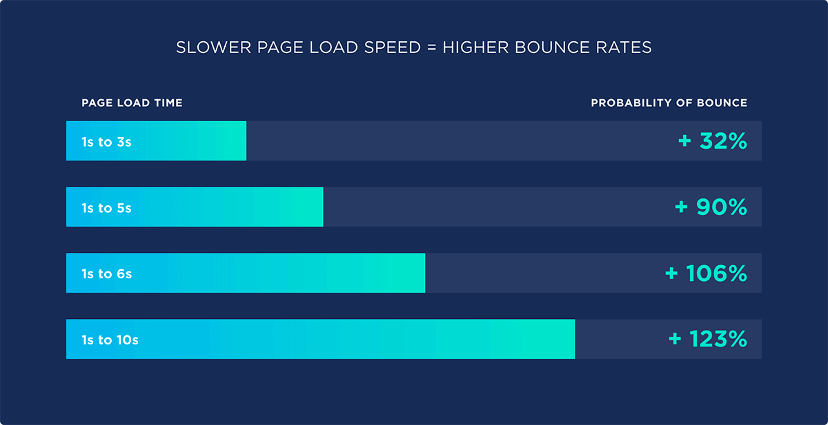
According to experts at Backlinko, if a page takes just six seconds to load, you could lose up to 100% of your potential leads.

In order to fix this, it’s important to make sure your site is prepared for large influxes of traffic and can handle engagement high points. If your pages buffer under pressure, you’ll quickly see your engagement levels dip.
The key here is to review your web hosting platform. Make sure that you invest in a web host with a large bandwidth and a server that can handle traffic hotspots.
3. Simplify Your Navigation
If you want your leads to convert, they need to be able to navigate your e-commerce site with ease.
Did you know that 70% of potential consumers abandon their shopping carts based on complicated navigation systems alone? If your lead struggles to find the product or service they are looking for, they won’t hesitate to bounce to a competitor.
Simplify your navigation flow, and ensure that you include easy-to-read drop-down menus, highlighted trending categories and a quick path to the checkout in your UX design. Your consumer should be able to find the information they are looking for in a maximum of 2-3 clicks.
4. Prioritise Accessibility
Did you know that over 15% of online users also live with some form of disability? If you want your engagement levels to remain high, ensure that your site is functional for an ability-wide demographic in order to open it up to a larger pool of potential consumers.
“To ensure that a website is accessible, I suggest companies consider, at a minimum, incorporating accessibility features such as alternative text for images, captioning for videos and keyboard-only navigation,” says the CEO of Mightily, Lesa Seibert. “Additionally, conduct regular testing and evaluations to identify and address any accessibility barriers, as website updates and modifications can sometimes cause issues.”

Take the BBC, for example. Using a ‘keyboard generated’ navigation system, users can customise their own site accessibility. Double pressing the tab key, for instance, allows browsers to skip content, while pressing it three times guides them straight to an accessibility help feature.
With higher demands for positive UX than ever before, consumers want to receive a customisable experience from the e-commerce brands they love. If you incorporate accessibility into your own UX design strategy, you won’t only see your engagement rise but your brand reputation too.
5. Switch up Your Content
If all else fails, it could be time to get down to the nitty-gritty and switch up individual pieces of content.
A whopping 38% of online browsers will stop engaging with an e-commerce site if they find the content boring or unattractive. Therefore, if you want to keep new leads and loyal consumers interested, you must constantly update your site content based on product trends and demographic demands.
We’re talking about introducing fresh visuals, new engaging headlines, and blog posts discussing on-trend topics. If your pages ooze with all things exciting in your industry, you can bet your consumers will want to stick around.
An Engaging Future
As we step into a more competitive era of e-commerce, site engagement will continue to be a top priority for every brand on the internet.
Whether you assess your site speed or refresh your page content, taking steps to improve your user experience could be the difference between an abandoned store and a conversion hotspot.


