Have you ever gotten lost on a website? Or not understand how to return to a page you were on that contained some insightful information? But then you press the button that brings you back to where you wanted.
This is the charm of breadcrumb navigation, simply called “breadcrumbs.”
What Are Breadcrumbs?
Usually, the principal navigation bar or site menu is at the top of the page, close to the breadcrumb navigation. Depending on the type of breadcrumb, it can show users how the site’s category structure applies to the page they are currently viewing or the route they took to get there.
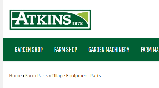
For instance, this is how the breadcrumb navigation appears on the Atkins website:

A site’s “secondary navigation” refers to the breadcrumb navigation. Breadcrumbs can be useful for both your site’s users and search engines when used properly.
These navigational tools can help consumers find material on your website more easily, get a sense of where they are on your website, and go back if necessary. Breadcrumbs show search engines how your website is organised.
The following three breadcrumb navigation choices:
-
Hierarchy-based
-
Path Based
-
Attribute-based
Navigation Using Hierarchy-Based Breadcrumbs
Hierarchy-based breadcrumb navigation, often known as “location-based breadcrumb navigation,” is the first concept discussed in nearly every article about breadcrumbs. This is the one every SEO agency will be familiar with. This is because it’s the most popular choice, particularly for websites with multi-level, complex site architecture.
This website’s architecture, or “hierarchy,” is followed by the breadcrumb navigation option, making it simple for visitors to anticipate and locate relevant content.
See the example below from Best Buy:

It demonstrates how hierarchy-based breadcrumb trails begin with the most general top-level category (in this case, Best Buy as a whole) and move via more detailed, nested subcategories until arriving at the present page. If the user changes their mind, they can quickly find something else by clicking on a more expansive category.
Navigation Using Path-Based Breadcrumbs
The “history-based breadcrumbs” or “path-based breadcrumbs” are like the browser’s back button for navigating. Even though this path is often not shown on its whole, they reflect the user’s particular journey that brought them to their current page. Particularly on e-commerce websites, this breadcrumb option can make it simple for site users to return to search results.
See below the example from Nordstorm:

The “Back” link in the aforementioned example is a path-based breadcrumb that takes the user back to the search results page. As you can see, it also sits next to the website’s breadcrumbs with the site’s location. Users benefit from both advantages in this way.
On interactive pages like web forms, path-based breadcrumbs are frequently utilised since they let users return to a prior stage while keeping all of the data they’ve already entered. The uploaded data can thereafter, if necessary, be modified by users.
Navigation Using Attribute-Based Breadcrumbs
When a product falls into numerous distinct categories at once, which might be challenging to display in a hierarchy, this can be helpful. E-commerce websites frequently use attribute-based breadcrumbs to narrow down the results of product searches.
See below the example from Old Navy:

The “filters” in the example are attribute-based breadcrumbs. Each one is connected to a distinct, particular quality of Old Navy’s clothes selection. A user can only see men’s t-shirts when they enter the string shown above. Without having to change categories, they could, however, delete any of those criteria or even add more.
To give customers the choice of viewing a complete category (men’s t-shirts) or filtering more narrowly within that category, Old Navy’s website in this example similarly mixes attribute- and hierarchy-based navigation.
The Benefits of Breadcrumbs for SEO
Breadcrumbs have numerous advantages for SEO, including:
Helping in the organisation of a site’s structure for users and search engines.
Giving consumers and search engines crucial details about the kinds of material you have on your site and how it is organised. This can improve how well search engines interpret your content while also enhancing the experience of site visitors and enticing them to stay on your site longer.
Showing up in search results
According to Google, breadcrumbs are used to contextualise your website’s content and include it in more pertinent search results. To help searchers better anticipate what will be on your page when they see it in their results, breadcrumbs are even presented in the SERPs.
Crawlability Improvement & Bounce Rate Reduction.
Breadcrumbs might aid in lowering the bounce rate because they make it simpler for customers to comprehend and browse your website. Establishing internal links between pages and categories, help enhance your site’s crawl ability, which may have a good effect on organic performance.
Enhanced Browsing and Search Functionality
The user experience (UX) of websites, particularly ecommerce sites, may be improved by allowing visitors to use attribute-based breadcrumbs as search filters and path-based breadcrumbs to return to those filtered results after clicking through.
Five Factors for Successful Breadcrumb Navigation
The following five suggestions will help you get the most out of your website’s breadcrumb navigation.
Use only breadcrumbs on YOUR website that makes sense.
When there are more than two layers of hierarchy in your content’s structure, breadcrumbs are usually the best option. Breadcrumbs are probably not going to add any actual information or value to your users if you have a flat site structure where everything is merely one click away from the home page.
Take into account the kind of content you offer on your website and how visitors are likely to access it. A hierarchy-based approach will typically be the best choice because it accurately reflects how your information is arranged.
However, if you manage an online store, for instance, a single product page could include a variety of different features that are shared by numerous categories (e.g. size, colour, brand). In that situation, it might also make sense to help customers in finding the things they’re seeking by combining attribute- and path-based breadcrumbs.
Use Breadcrumbs that Address the Needs of Your Audience.
Think about it:
- What details should your audience be able to find most easily?
- Which pages are the most and least popular right now?
- What pages are the easiest and hardest to access?
Take note of how those websites are structured and how they employ breadcrumbs if you are aware of any similar or market-relevant websites where your target audience is likely to spend time. You can find out from this what your viewers would anticipate seeing.
If the content of your website is logically organised, the next step is to ensure that your breadcrumbs are distinct and consistent. Here are a few issues to be on the lookout for:
- Apply the same naming convention to all pages.
- Try to use as few words as you can and keep your breadcrumbs brief.
- Use your breadcrumbs, if you can, to include more keywords.
- Make sure the breadcrumbs are arranged logically (i.e. location-based breadcrumbs should increase in specificity).
Breadcrumbs should be arranged logically.
However, depending on your website, what your clients want, and what is typical in your business, your demands might change. If you’re unsure, look into the websites of your rivals to see how they’ve incorporated breadcrumbs into their navigation.
Maintain a simple breadcrumb design.
They appear just like standard text links as a result on a large number of websites.
In a small but readable typeface that matches the rest of their website, Nordstrom’s breadcrumbs can be located near the top right corner of the screen. Even the dividers between the groups are easy to understand. These breadcrumbs are simple to find and comprehend, yet they don’t demand any more attention than is necessary.
Your Breadcrumbs Benchmark.
Before settling on your breadcrumb option, it’s a good idea to split-test whether you’re adding breadcrumbs to your site for the first time, changing your category names, or changing how they are put out. This can assist you in identifying and resolving any potential bad outcomes before they have a significant effect.
If you’re making numerous updates, it’s best to tackle them one at a time because split-tests work better for smaller and more incremental changes. In this manner, your test will produce more trustworthy findings, and you may update your website knowing that you made the right choice.
Improve SEO and UX with Breadcrumbs
Although breadcrumb navigation may appear straightforward, ensuring that it functions correctly, is user-friendly, and is consistent across all pages of your site can be more difficult.
Author Bio:
Dylan Thebault is an SEO executive at Digital Funnel, an SEO agency helping SMEs. They provide SEO in Dublin & Cork.


