


As more people use different devices to browse the web, websites must be designed to work smoothly on different screens. Responsive web design (RWD) ensures that websites automatically adjust to fit any screen, whether it’s a phone, tablet, or computer. Building a responsive website requires careful planning to ensure all elements work together seamlessly.
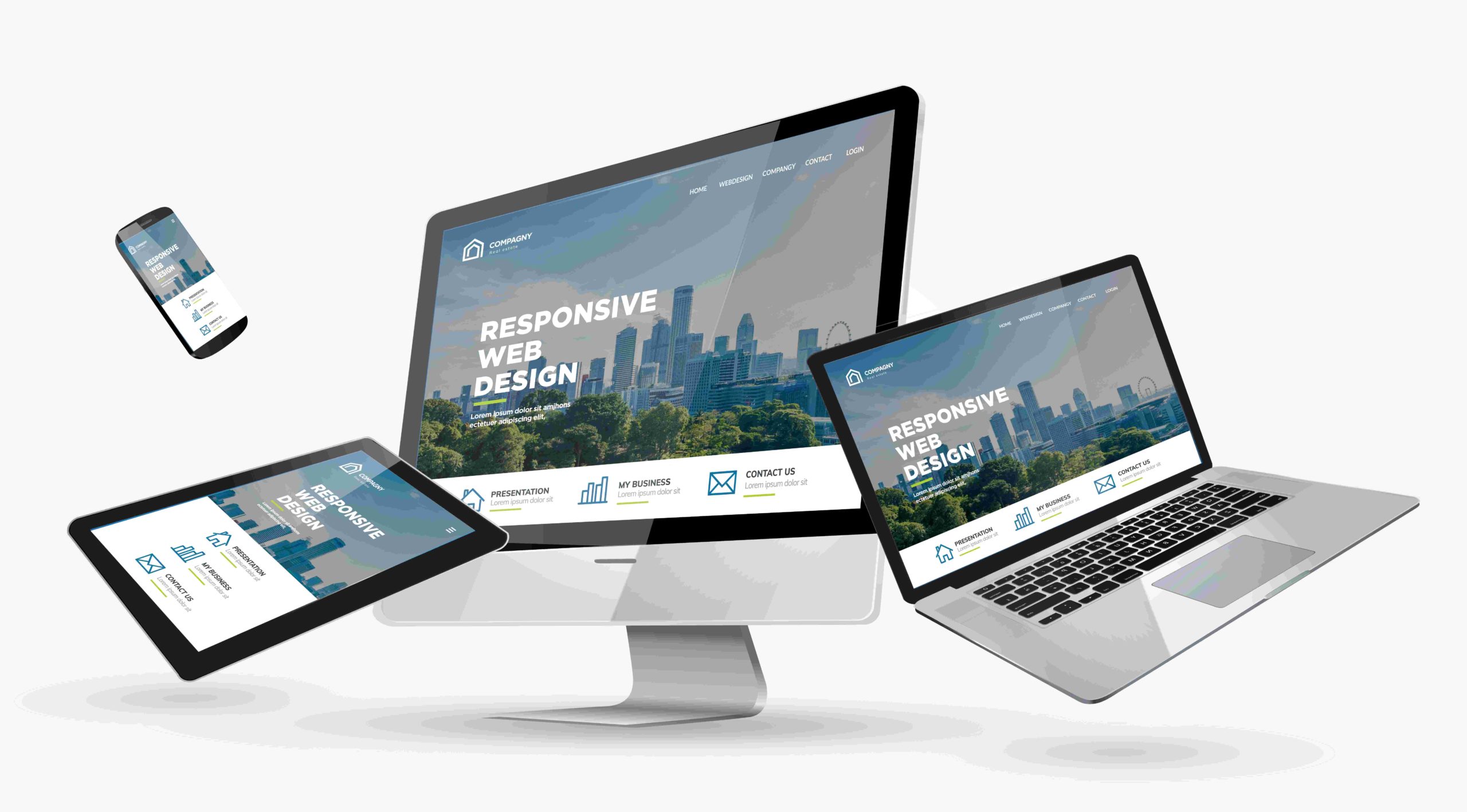
This article will cover the important aspects of responsive web design and explain how to create a website that functions well for everyone.
What Is Responsive Web Design?
Responsive web design refers to creating a website that looks and functions properly on any device. The website adjusts its layout depending on the screen size, making navigation easy on phones, tablets, or computers. This company and other web developers can help give users a smooth browsing experience without the need to zoom in or scroll horizontally, regardless of the device used.
With this foundation in place, it’s time to explore the essential design elements of responsive web design.
Flexible Grid Layout
A flexible grid is at the heart of responsive web design. Instead of using fixed-width layouts, which may not display well on all devices, flexible grids adjust to the screen size. This is accomplished by using percentages instead of fixed units like pixels.
For example, setting an element to take up 50% of the screen ensures it will adjust to half of the screen’s width, whether viewed on a smartphone or a large monitor. This allows for smoother transitions between different screen sizes, keeping the layout consistent and adaptable.
Fluid Images
Images play a significant role in capturing users’ attention, but they can create problems if they don’t adjust properly. In responsive web design, images need to be fluid, meaning they resize based on the device. This can be achieved by setting the image’s maximum width to 100%, allowing it to shrink or expand based on the screen size.
For example, when a large image is displayed on a small mobile screen, a fluid image will resize accordingly without losing its aspect ratio or overflowing. This ensures that images remain visually appealing and maintain the integrity of the overall design across devices.
Media Queries
Media queries are a crucial tool in responsive web design, allowing different styles to be applied based on the device’s characteristics. These characteristics can include screen width, height, and resolution, among others. Media queries instruct the website to change its appearance depending on the device, ensuring an optimized viewing experience.
For instance, media queries can be used to increase the font size on larger screens and decrease it on smaller ones. This adaptability ensures that users have a consistent experience no matter which device they are using.
Designing for Touchscreens
Touchscreen devices are now a common way people access websites, so designs must accommodate this interaction. Interactive elements like buttons and links should be large enough to tap easily, preventing users from accidentally selecting the wrong item. Additionally, swipe gestures can enhance navigation, allowing for more intuitive browsing.
For example, designing a photo gallery with swipe gestures improves the user experience on touchscreens. Ensuring that buttons are at least 44 pixels by 44 pixels in size allows users to interact with the site without frustration.
Scalable Typography
Readable text is a vital part of any website, and responsive web design requires text to be clear on all devices. Instead of using fixed font sizes, it’s better to use scalable typography, which adjusts automatically to the screen size. This can be done by using relative units like “em” or “rem” for font sizing.
For instance, setting the body text to 1em allows the text to scale based on the default font size of the user’s browser. This approach makes the content more readable on both small mobile screens and larger desktops, improving the overall user experience.
Optimizing for Speed
Responsive websites are essential to keeping users engaged, and responsive web design plays a key role in optimizing speed. Slow-loading pages can lead to users abandoning the site, so optimizing images, compressing files, and minimizing the number of requests the site makes is critical.

One effective method is using lazy loading for images, which means images are loaded only when they are about to be viewed as the user scrolls down the page. This speeds up the initial load time, particularly on slower mobile networks. Additionally, caching content locally can reduce the need to reload certain elements every time a user visits the site.
Adaptive Navigation
Navigation should be simple and intuitive, no matter the device. Larger screens can often accommodate a full navigation bar, while smaller screens may require a more compact solution. One popular approach is the “hamburger menu,” which hides the navigation behind a collapsible icon on mobile devices.
This method keeps the user interface clean and uncluttered while still providing users with quick access to the entire site. Ensuring the navigation is easy to use, and well-structured can make a significant difference in giving a better user experience.
Testing Across Devices
Testing is a key part of building a responsive website. With so many different devices available, thorough testing ensures that the website functions correctly on all of them. Using online tools like browser developer tools or services such as BrowserStack can simulate how the site will appear on various screen sizes.
It’s essential to test on actual devices as well, as simulations may not always catch every issue. Regular testing guarantees that users have a consistent experience regardless of the device they are using.
Mobile Optimization and SEO
Responsive website design isn’t just important for user experience; it also impacts search engine optimization (SEO). Search engines like Google prioritize mobile-friendly websites in their rankings, which means that responsive sites are more likely to appear higher in search results.
For example, a website that loads slowly or is difficult to navigate on mobile devices may rank lower in search results, reducing its visibility. Optimizing a website to be responsive not only benefits users but can also help improve its performance in search engine rankings.
Accessibility for All Users
A responsive website should be accessible to everyone, including users with disabilities. This involves ensuring that the site can be navigated easily with screen readers and that the text is clear and easy to read, even for those with visual impairments.
For example, adding descriptive alt text to images allows visually impaired users to understand the content better. Incorporating accessibility into responsive design helps ensure that the site is usable for all individuals, regardless of their abilities or the device they are using.
Conclusion
Creating a responsive web design is about more than just making a website look good on different devices. It requires thoughtful planning and the integration of flexible layouts, fluid images, scalable text, and optimized navigation. By incorporating media queries, optimizing for speed, and testing regularly, a website can provide a seamless experience across all screen sizes. In addition, focusing on accessibility and mobile-friendliness can improve both the user experience and the site’s search engine ranking. A well-designed responsive website not only meets users’ needs but also helps businesses stay competitive in today’s diverse online world.