Choosing colors or an entire color palette for a logo design is a significant decision. Our aesthetic preferences, learned conditioning, and cultural associations, as well as evolution, determine how we perceive and respond to colors. As you can imagine, there is a lot of room for subjectivity here.
Therefore, while on the surface, choosing a color scheme may seem like a purely creative process with the whole color spectrum to choose from, there is an underlying logical process to it.
We can break down that process into three important areas:
-
Choosing an idea before we choose the color
-
Researching the competition/industry
-
Being mindful of the scope of the logo
You don’t necessarily have to follow these steps in any particular order, just ensuring that all three are present in your wider color selection strategy will be sufficient.
Now, let’s look at each of these processes in detail.
1. Choose an Idea before Color
Whether you are designing a logo mark or a wordmark, the idea must come before the color. It’s important for a few reasons:
-
Let the idea show it can carry the brand message without relying on colors.
-
Help everyone respond to the idea without any color bias (positive or negative).
-
You need to see if the design works on its own without color helping it along.
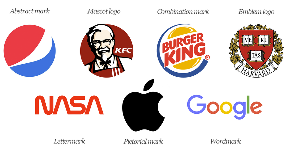
You need to gauge the strength of your company logo. For that, it must fully stand on its own in black and white. If it’s strong enough, communicative enough, and just works, it won’t need color to make it meaningful. Think of the Target logo, for a second. In black and white, it loses its meaning and distinction. Without the signature red and white color, the shape alone doesn’t mean anything. It’s just another black and white circle.

We cannot say the same for the Apple logo. Take away the color (as they have already done) and it’s still the most famous bitten apple in the world, representing the most innovative and the most stylish tech company in human history.

It’s the same for well-designed wordmarks, too. Think of Coca-Cola, Levis, and Amazon. Each of the logos is perfectly meaningful and communicative of its brand with or without color.
On the other hand, if you create a brand identity design that only works when presented in color, then it doesn’t work. Colors are only to make the logo more noticeable, memorable, and recallable – the idea must be enough on its own in black and white.
2. How the Competition Uses Colors
The market research also plays an important role in your color selection process. You have to strike a balance between relevancy and distinction. Your chosen color must be something that people can easily associate with your industry/market but it should not be something every one of your rivals may be using.
In other words, don’t be another restaurant with red and yellow branding. But don’t also choose brown for your greengrocer’s brand.
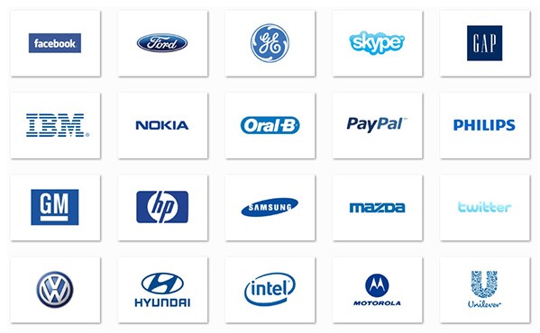
This balance will come when you understand that most industry-leading colors do not have anything inherently relevant to that particular industry. Take the communication industry’s obsession with blue color.
When you think about it, blue doesn’t represent anything about cell phones, WiFi, or fiber optics. Yet, most tech brands and communication companies predominantly go with blue in their branding. From Facebook to AT&T, it’s everywhere.

And here is your chance to make your mark.
Look at your competition to understand how they treat colors. If their associations are mostly band-wagon choices, you can swim against the flow and use colors to make the logo instantly more distinguishable and noticeable.
If the industry’s color choices are mostly reliant on popular color associations or natural responses (green, as opposed to brown, with ecology brands), then perhaps using a different variation of the popular color or using contrasting colors in the scheme makes more sense.
3. Consider the Scope of the Logo
A logo has to go many places: on the sign over your door, your newspaper ad, the office coffee mug.
It also has many uses: be a website favicon, an app icon, and a social media profile picture, to name a few.
Depending on all these many roles and contexts, it must be legible, recognizable, and aesthetically uniform without the bounds of space, size, orientation, and most importantly, color.
Take this scenario, for example.
You have created a restaurant logo and have chosen the mighty silver to define its sleek and executive appeal. While it looks brilliant on the metallic surface of your restaurant sign, it doesn’t hold that same pull when it appears as a print ad on a newspaper.
Consider another example. A logo with a yellow monochrome theme may look inspiring on the website header, but do the shades differentiate themselves when forced into a tighter space, such as a website favicon?
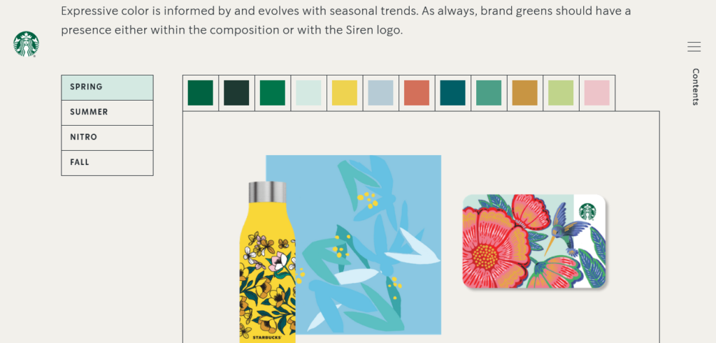
To build a brand identity that works on every surface, in every size, and for every person, your brand color palette needs to be large, diverse, and inclusive. Say, from 3 colors you perhaps need to go to ten.

You also should consider if a monochrome theme is better or something more complementary, and thus striking. Also, keep in mind that every shade/hue in the palette must harmonize with each other. The overall look, no matter which colors from the palette you combine in a given situation, must stay true to your brand, remain cohesive, and always be recognizable and understandable.
Conclusion
The abundance of color variety has made branding more complex than it ever was. From color psychology to color’s impact on visual perception, so much needs to be on the table before a decision can be finalized.
We hope our exploration of the three major design areas (color-wise) today will keep you focused on what matters, and help you arrive at the decision with more logic and less lore.


